This chart shows the percentage of increase or decrease, from the previous grade in the previous year, in the number of students across the nation enrolled in the 8th, 9th, and 10th grades.
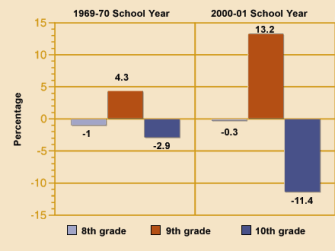
SOURCE: “The Education Pipeline in the United States, 1970- 2000,” Boston College